viimed Rebranding patient care
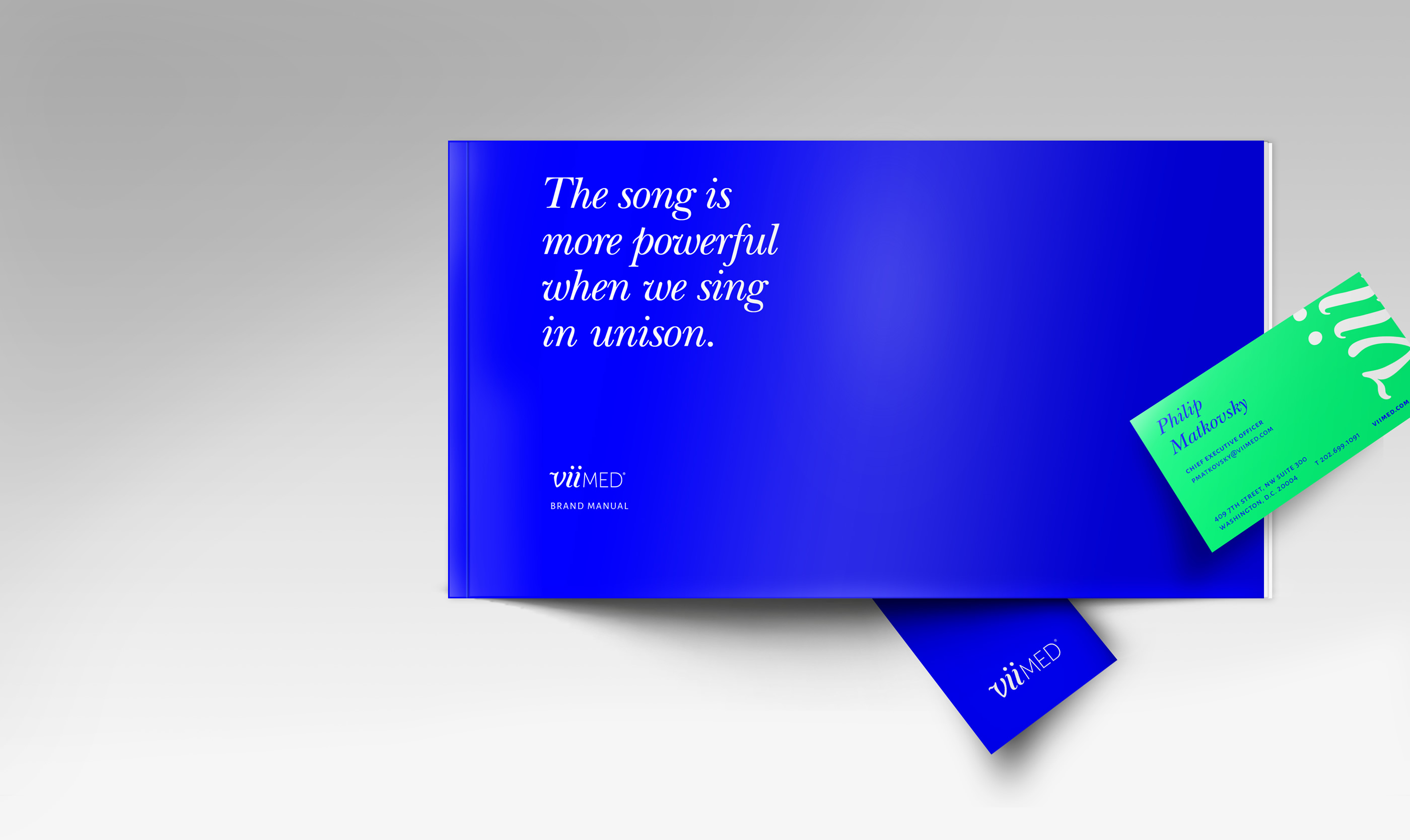
The Power of Singing in Unison.
When a company is built around the belief that every single day is an opportunity to empower others, branding becomes the heart of the matter.
ViiMed
Everyone wants marketshare.
But the ‘R’ word isn’t something most companies look forward to or even want to mention.
ViiMed recognized that the loss in their marketshare had a lot to do with the lack of a solid brand platform. Being an innovative startup with game-changing technology wasn’t enough to compete in an oversaturated, exponentially growing healthcare techonology marketplace.
They were at a pivotal point in the lifecycle of their company — rebrand or fade.
Healthcare branding entails many extra regulatory restraints and governance that many other markets don’t have to consider, making a rebrand even more inhibitive. ViiMed turned to us expecting a painful process, but instead were surprised to be completely re-energized and empowered throughout by their new, unified vision.
Competitive Landscape Audit / Rebranding / Visual Language / Copywriting & Brand Messaging / Digital Marketing Materials & Website Design

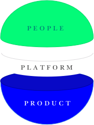
Determining Brand Equity
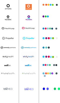
Auditing the Competition to Determine Strategic Advantage
How to differientate.
Before we started any design or strategy, we needed to determine ViiMed’s competitive landscape.
What were potential clients comparing them against? And what were audience perceptions?
We analyzed over 15 of their direct competitors on their use of: color palette, photography style, marketing lead-generation devices, brand messaging, tone of voice, design conventions, and UI / way-finding. Knowing these made it clear to everyone on where (and how) we could visually rebrand ViiMed as an innovator in their industry. We delivered a competitive overview with our recommendations on positioning and brand strategy using this insight.
Our analysis made it clear what strategies ViiMed should take, and eliminated most of the subjectivity involved in the usual process of rebranding.
What is the competition’s messaging?
What visual & brand devices are they using?
What is their brand promise?
What marketing strategies are they employing?
ViiMed
Brand Standards Manual 2017
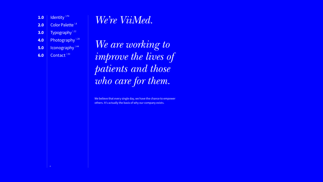
Brand Strategy
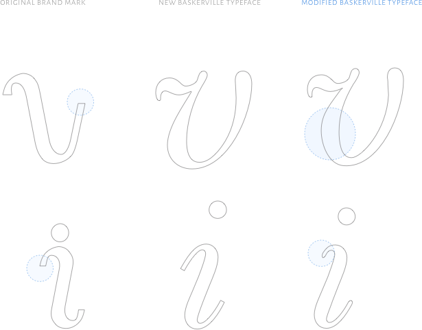
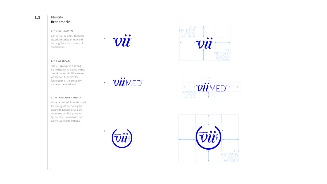
Updating the Brandmark
modifying weight, roundness and implying forward motion
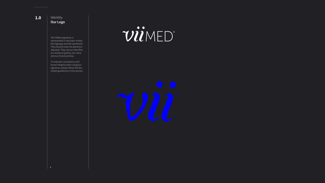
ViiMed had some equity in their former logotype ‘vii’ that was worth keeping, but their original concept of motion and visual flow wasn’t conveying as they wanted. The letterforms were disjunctive, stiff and blocky. By updating their logotype with a custom version of a classic typeface and replacing the sharp, square edges with rounded corners, it now conveys more of their original vision and now has a friendly, humanistic, fluid feel.
Brand Strategy
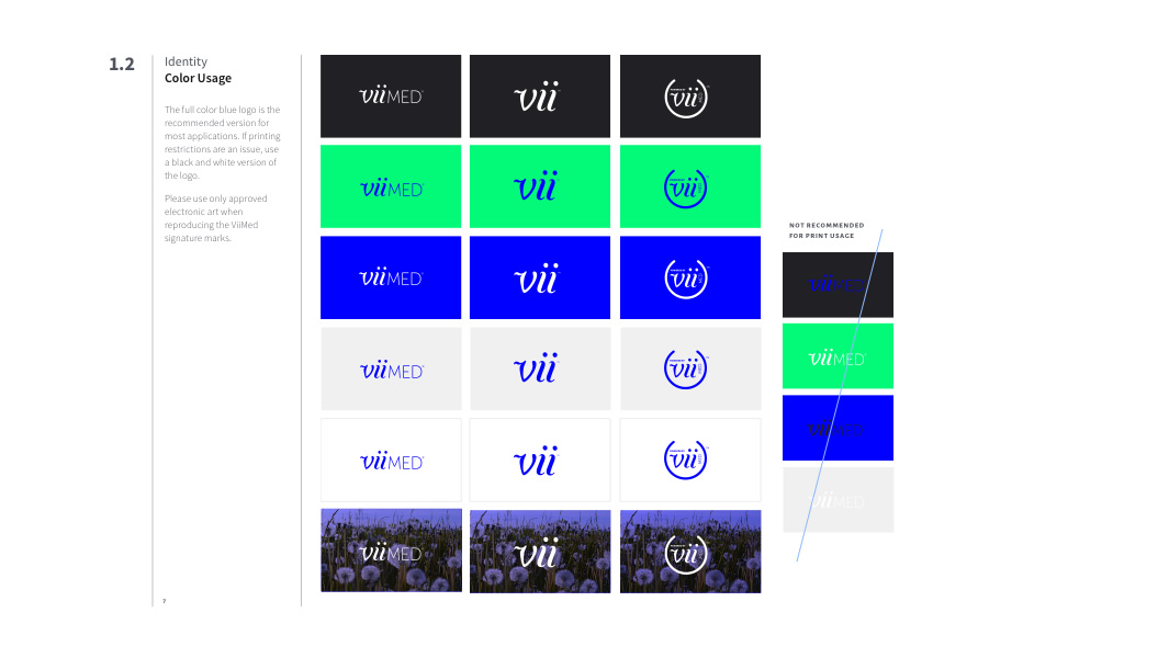
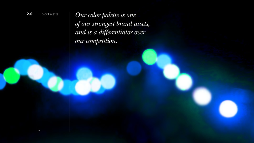
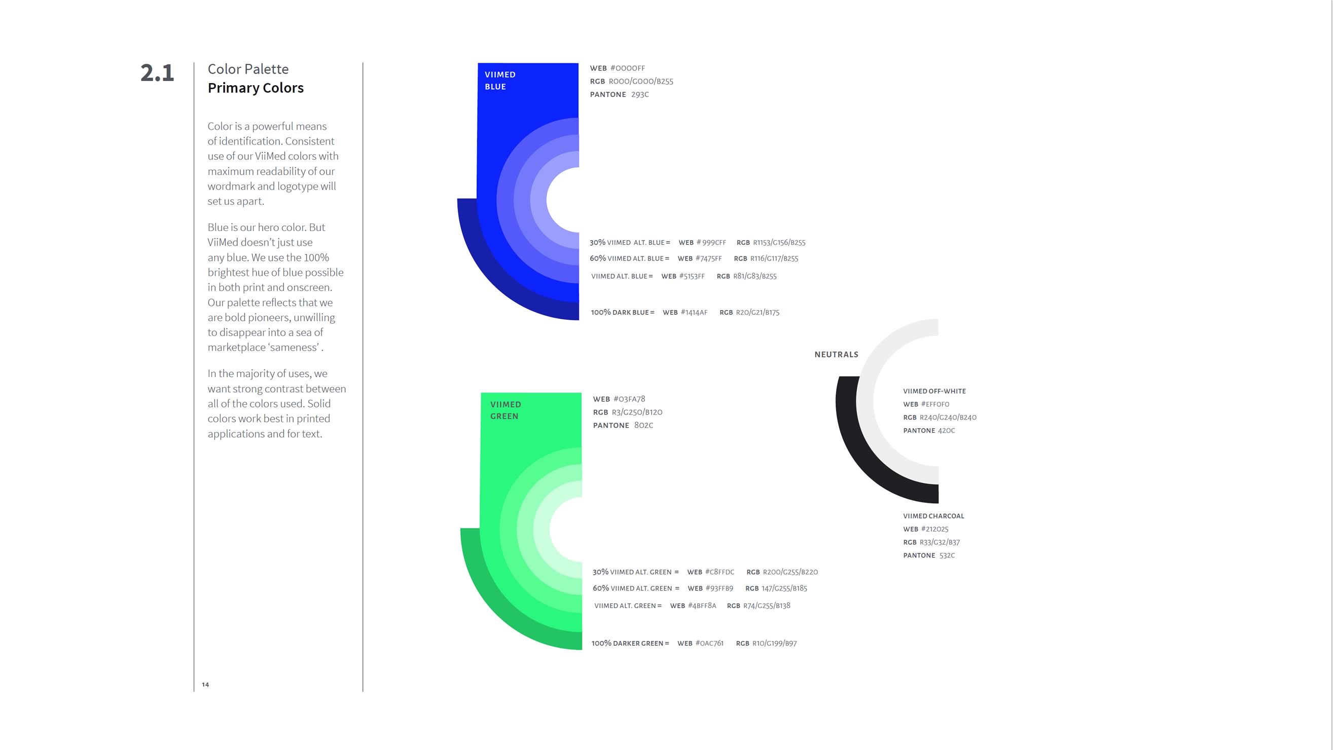
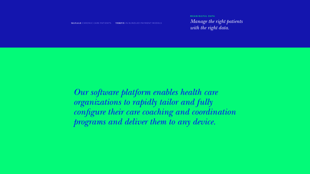
Color Palette
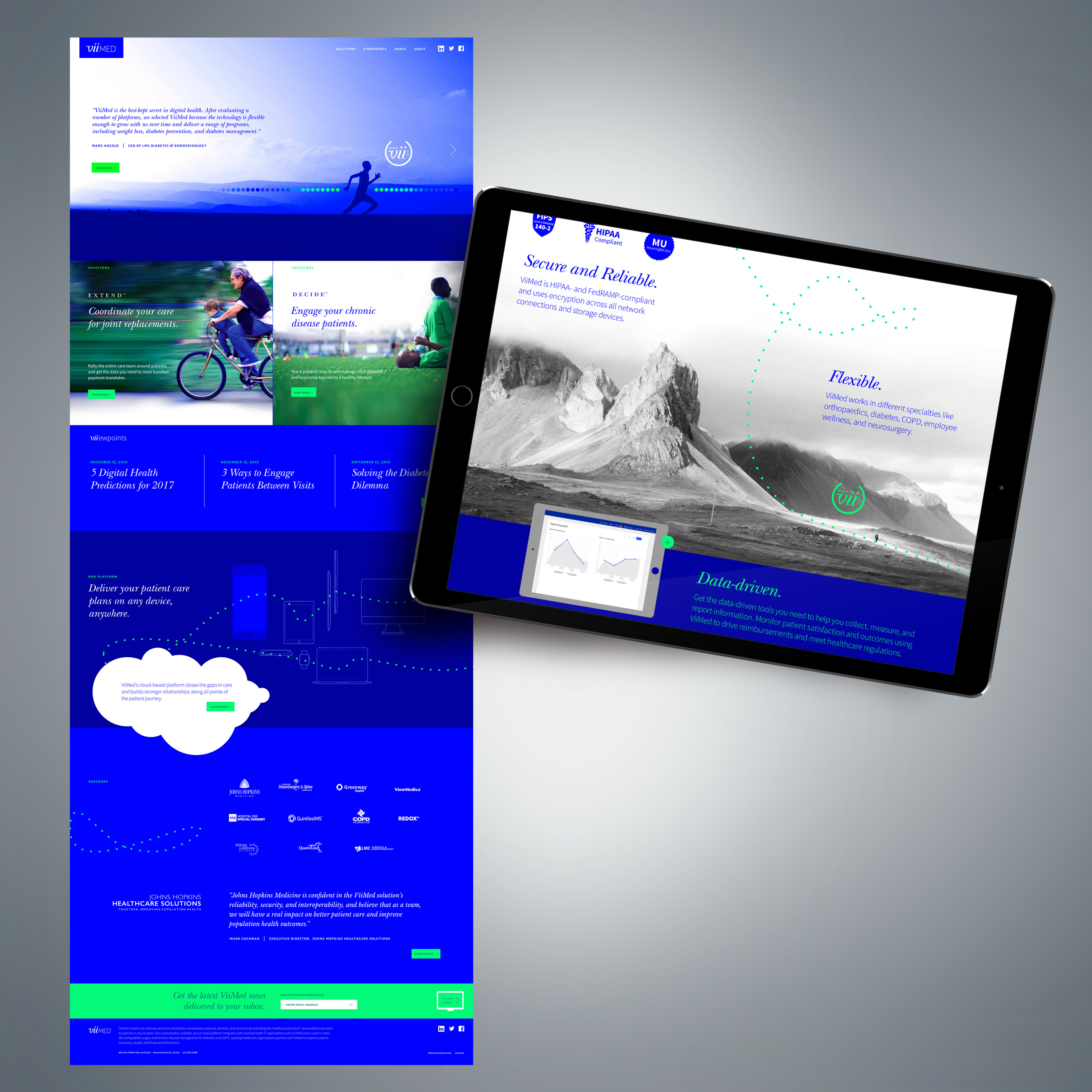
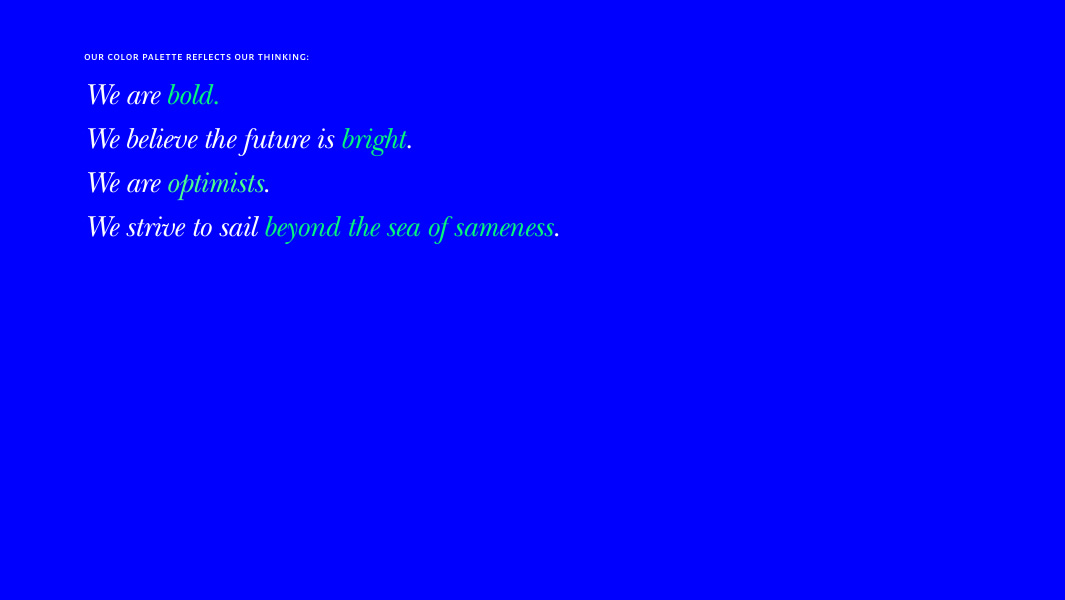
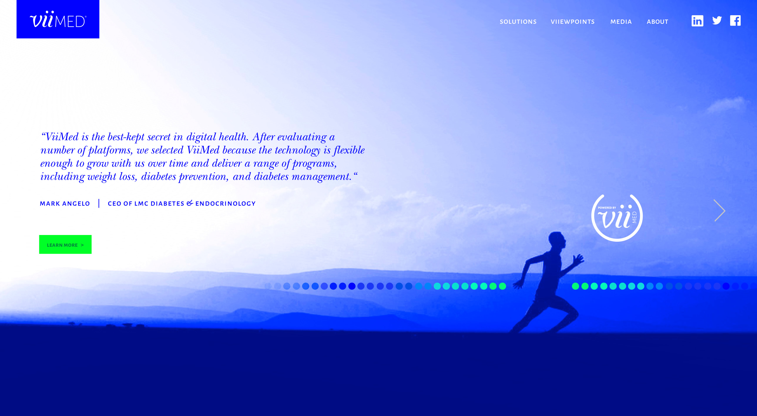
The power of color
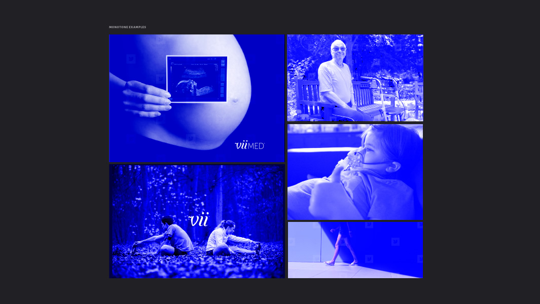
The majority of ViiMed’s platform consisted of content on screens — both online and through their app. Shifting their color palette from a dark, muted navy blue to one that was highly saturated and vibrant (and made better use of the backlit screen) reflected their philosophy of being bold pioneers in their industry. It also kept them from disappearing in a sea of sameness — brighter and bolder than their competition.


Brand Strategy
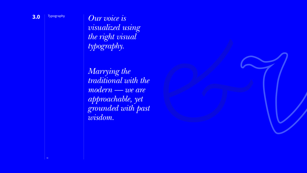
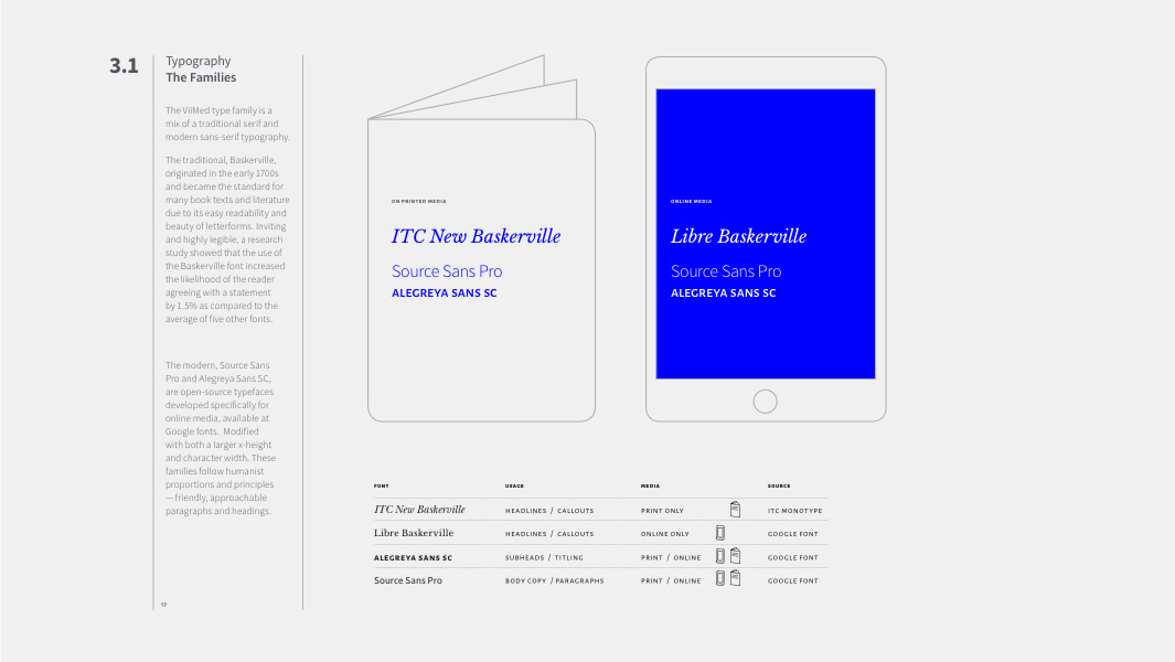
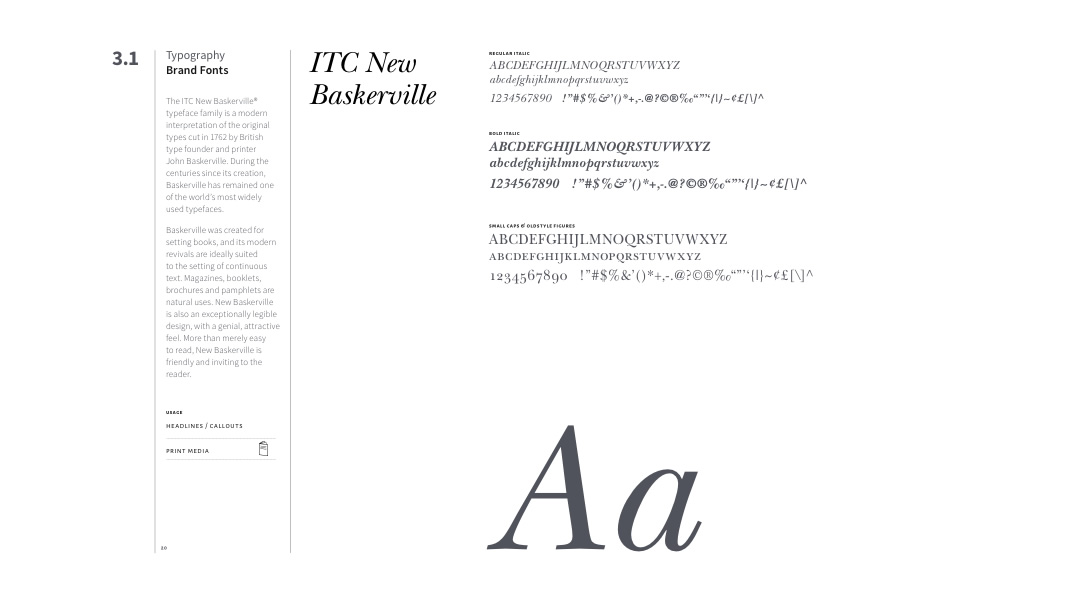
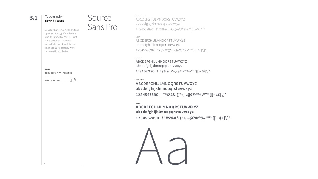
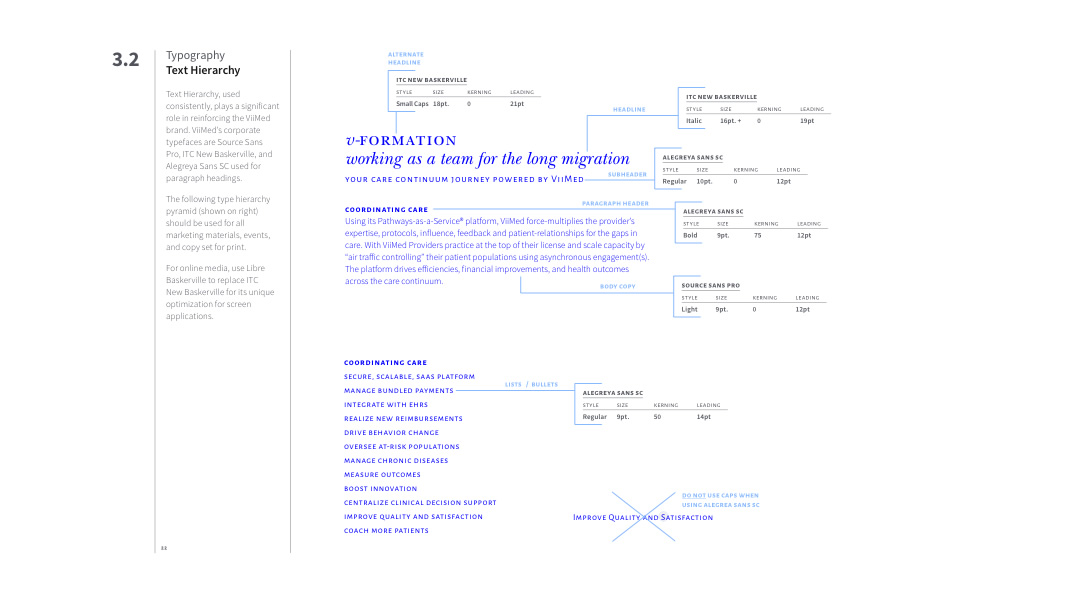
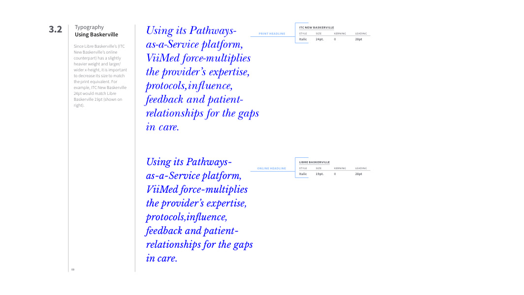
Typography
typographic ‘voice’
Typography is a key element in all ViiMed’s marketing materials, as it directly interprets their personality and tone of voice. Marrying the traditional serif with a modern digital typeface helps convey integrity, approachability, and forward thinking.


Brand Strategy
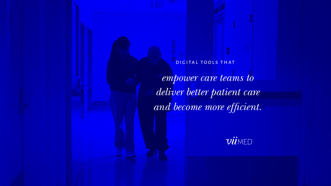
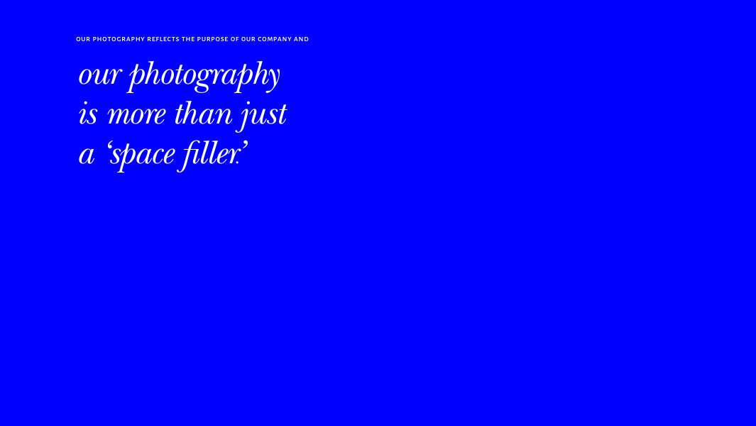
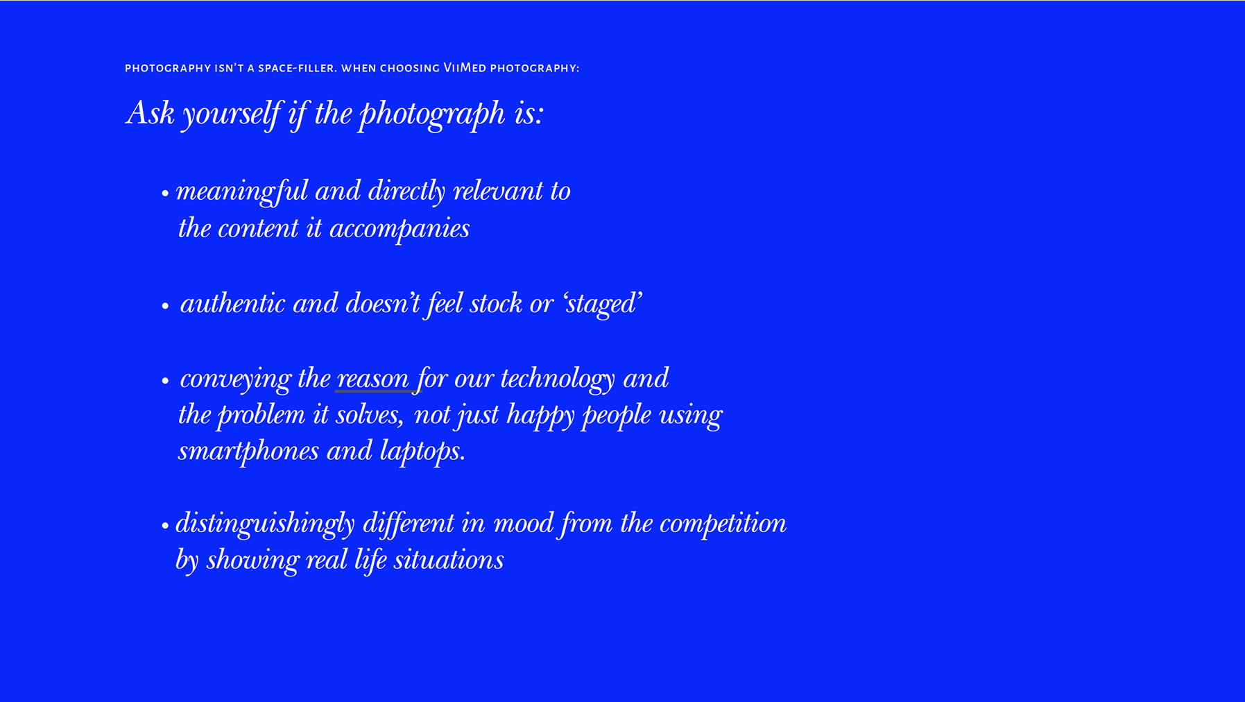
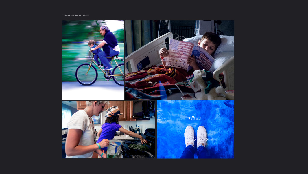
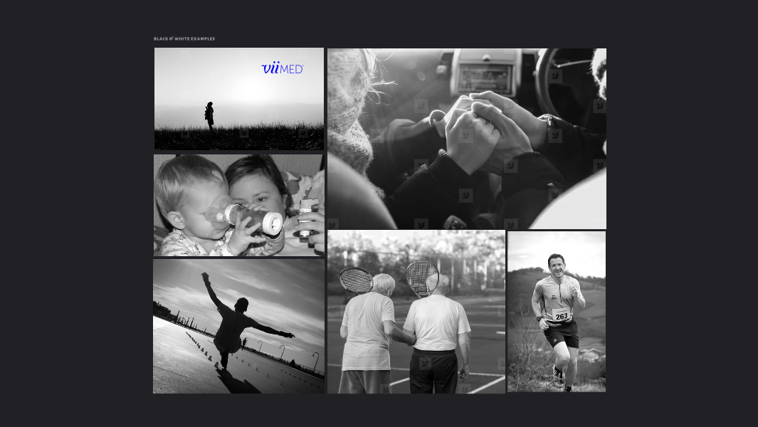
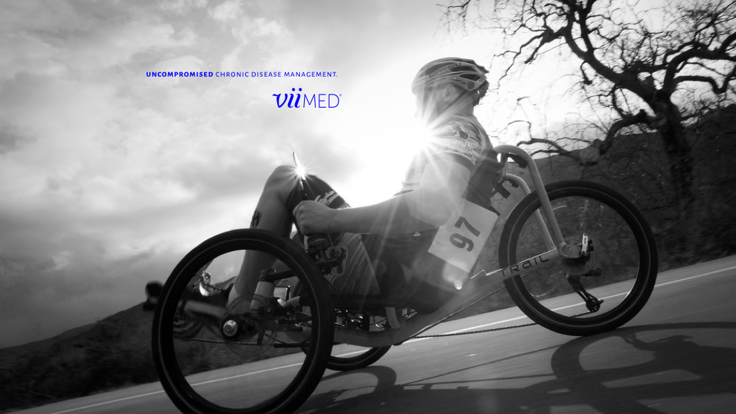
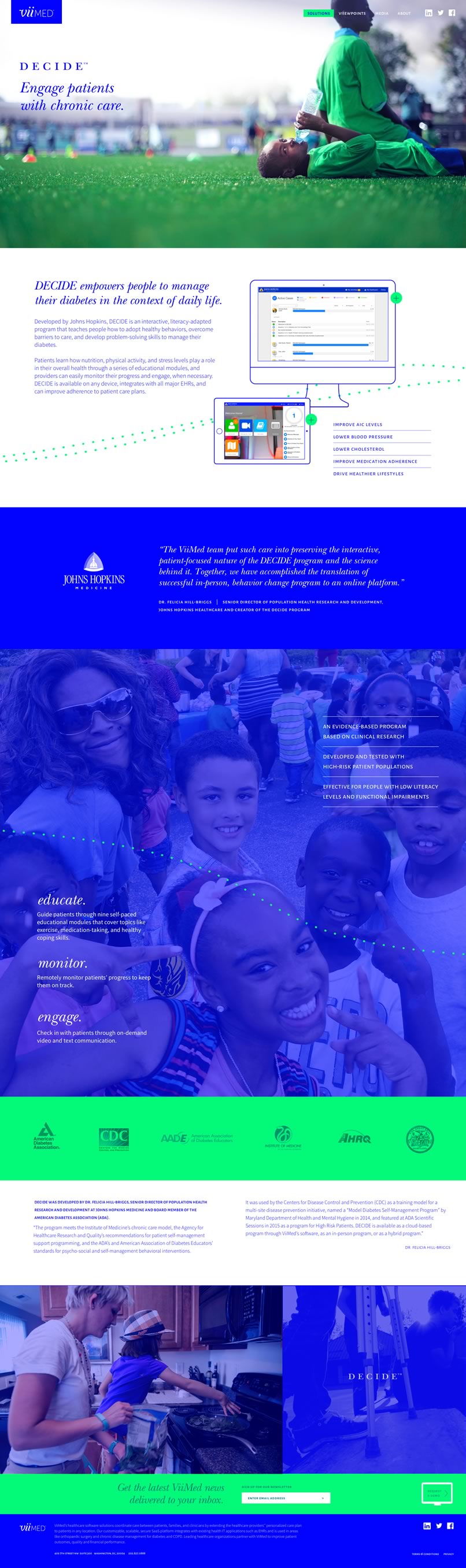
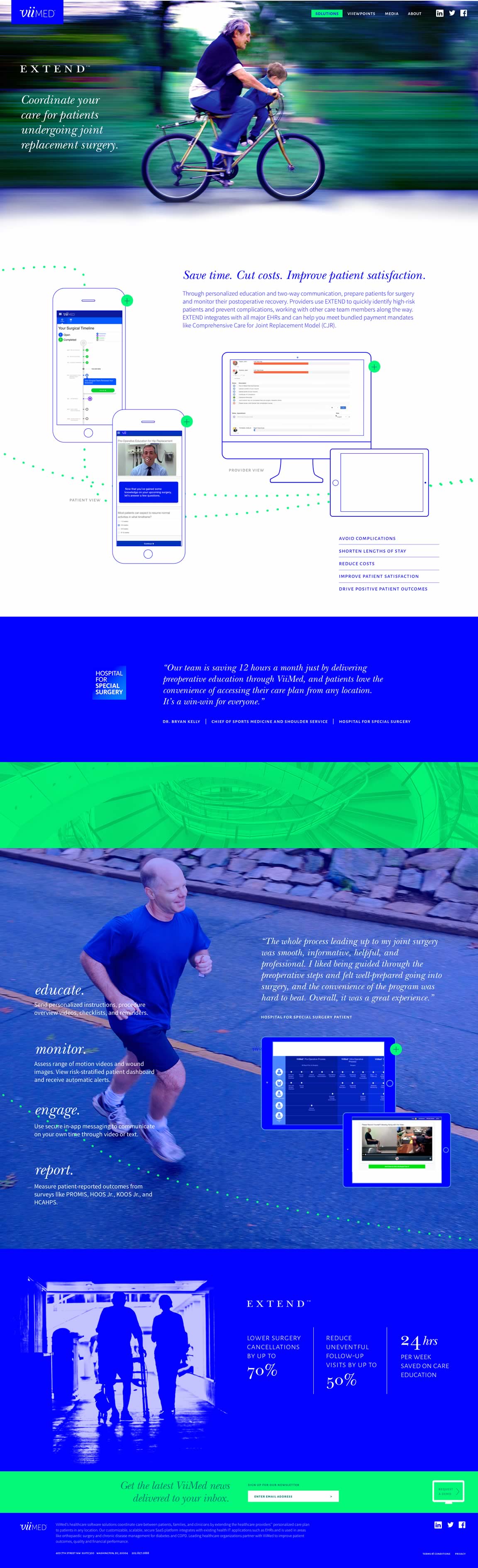
Photographic Style
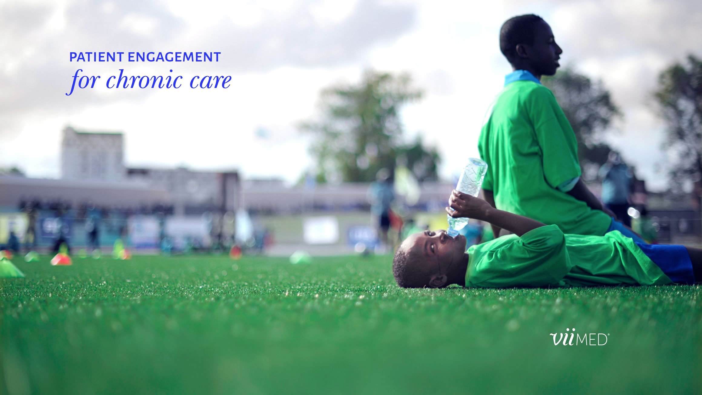
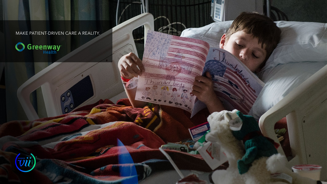
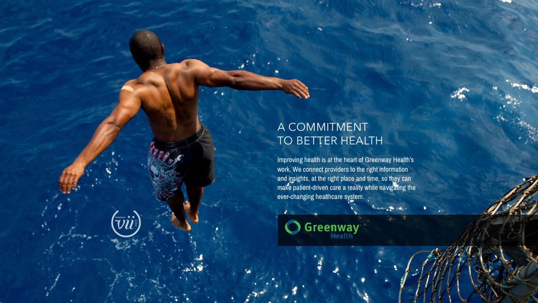
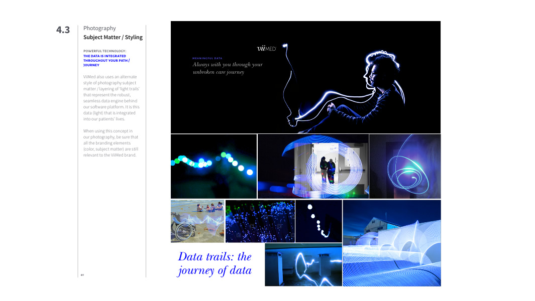
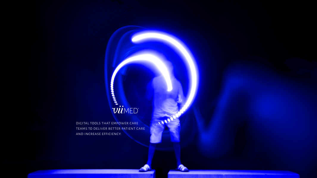
a branded ‘documentary’ style
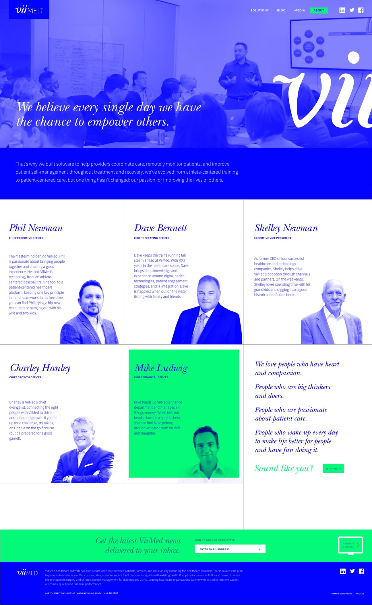
Doing our competition audit, we noticed that the industry standard way of treating photography seemed like an afterthought. Subject matter and scenes were very generic (they could be used in any industry or swapped out on competitor’s site), and focused on people holding technology instead of why the technology exists. Instead, we focused on creating specific guidelines for visually branding their photos, while using documentary-style scenes where the patient is enjoying the result of the technology— not its interface.


Brand Strategy
Campaign Concepts and Brand Messaging
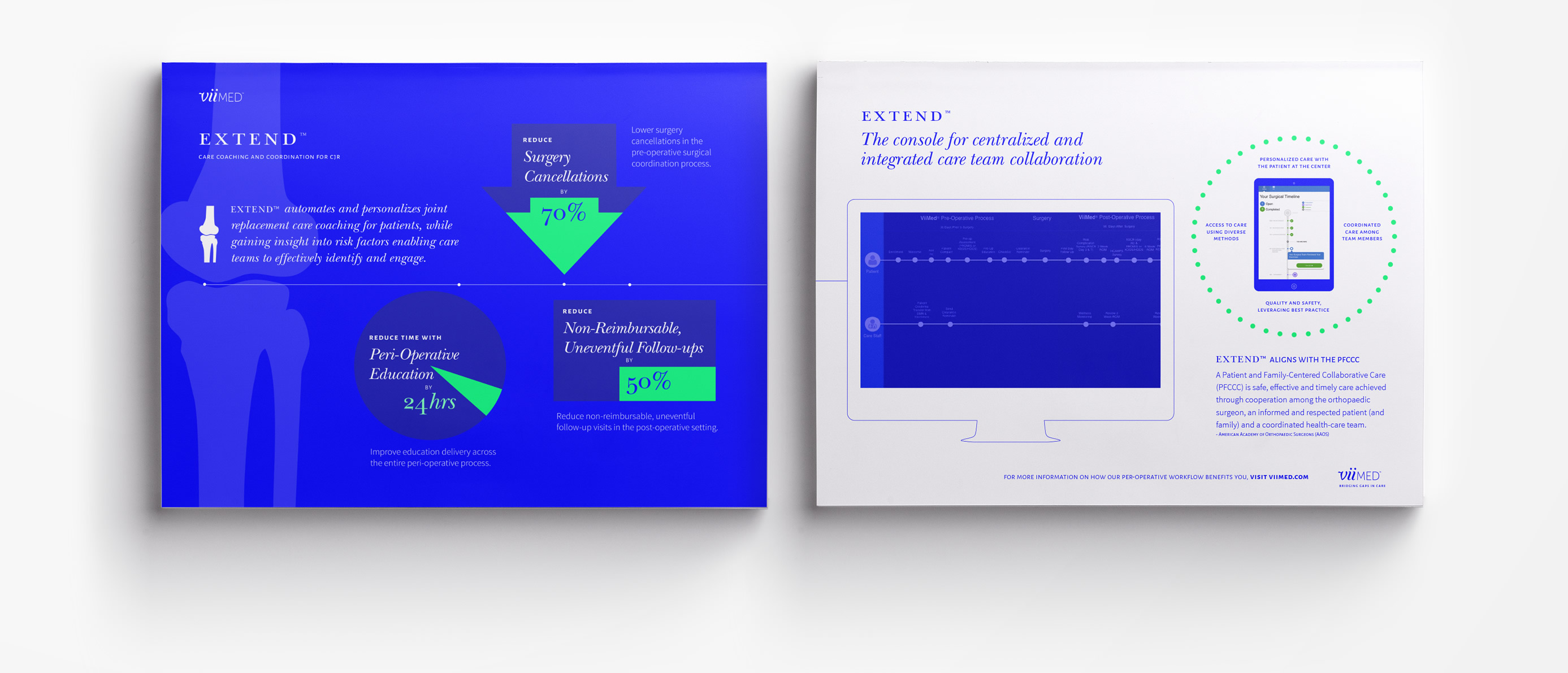
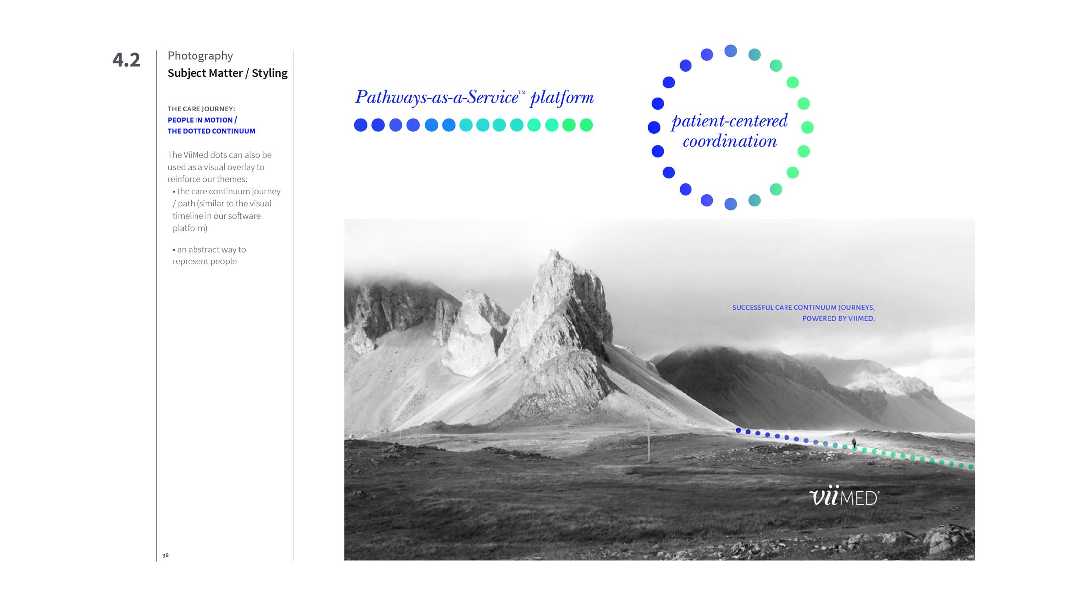
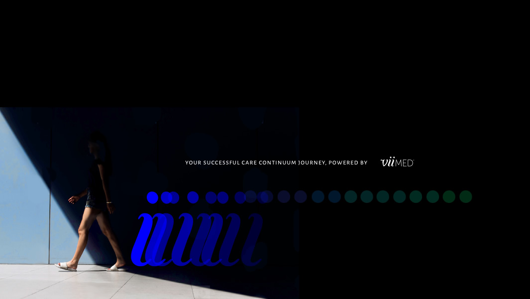
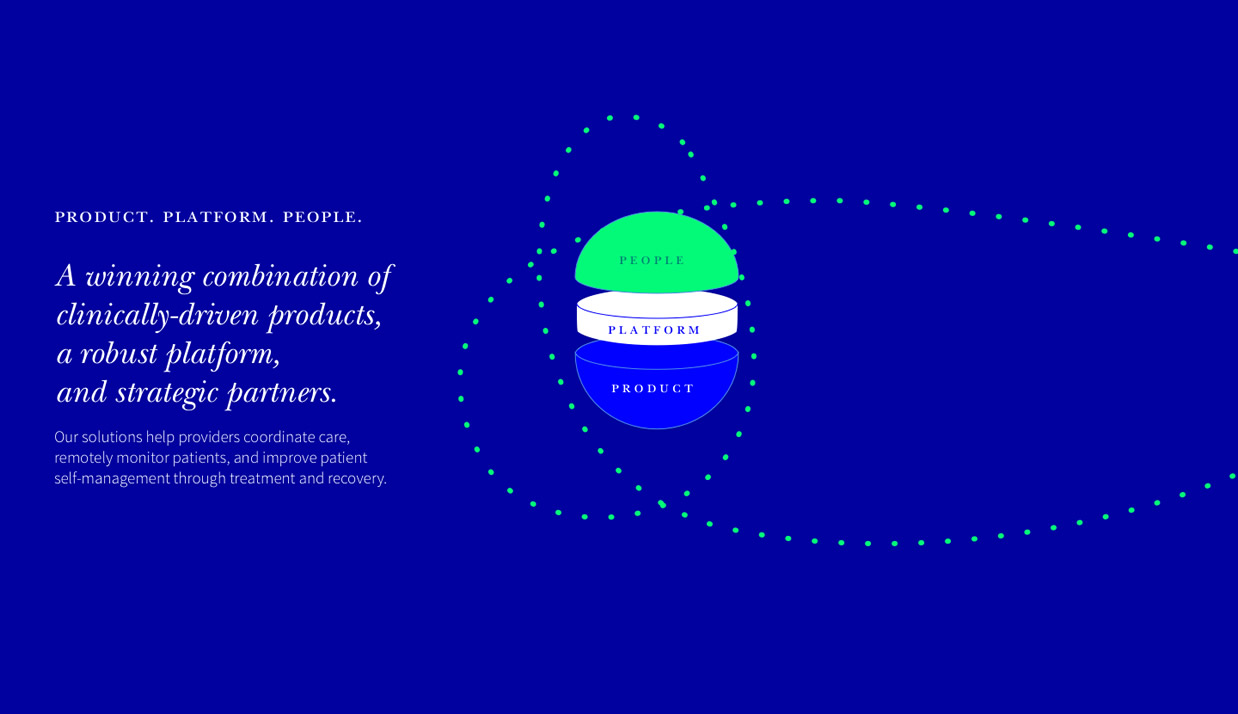
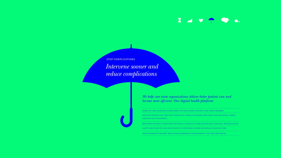
the dotted continuum
The dotted path is a concept at the core of ViiMed’s SaaS platform creation. Their software enables a continuous engagement between caregivers and their patients throughout their care continuum journey — one with checkpoints and without gaps. The dotted concept directly ties into their logo and gives a graphic concept that they can use throughout their marketing in various ways.
Brand Strategy
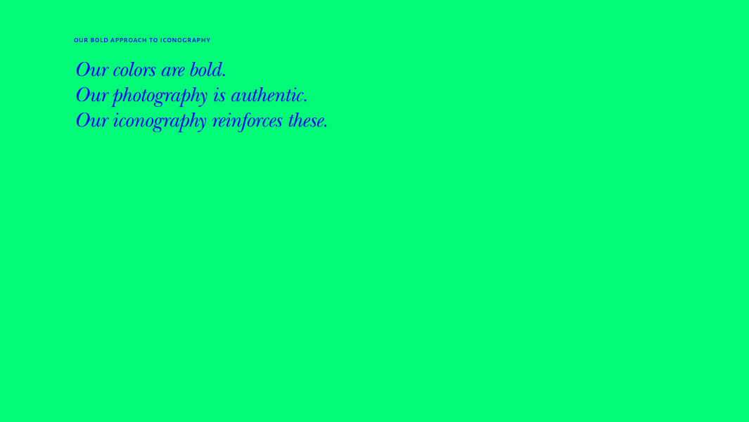
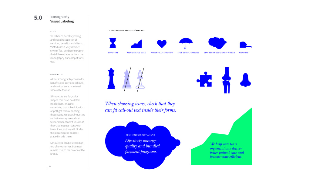
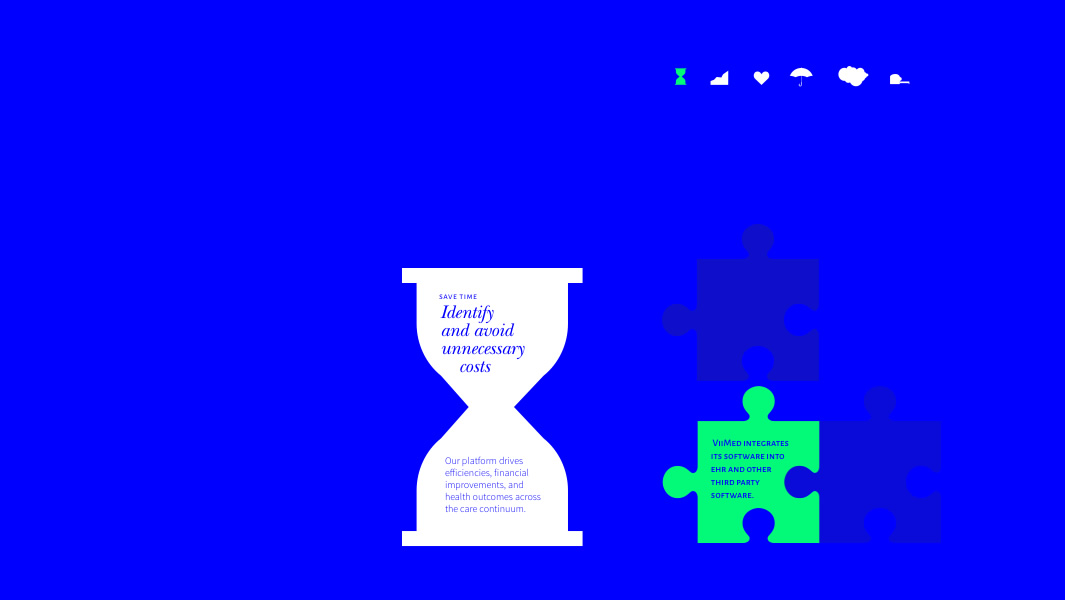
Iconography
Scalable silhouettes
We also wanted to rethink their iconography to gain competitive distinction.
To enhance the storytelling and visual recognition of services and benefits, the silhouette format of flat colored shapes have a two-fold function—1. to use as icons when categorizing content or wayfinding, and 2. to enlarge as graphic elements for callout text to be placed inside of them. This curation of symbols helps prevent generic icons from being used as ‘filler’ placement and allows the iconography to tell the story where photography would be too difficult.

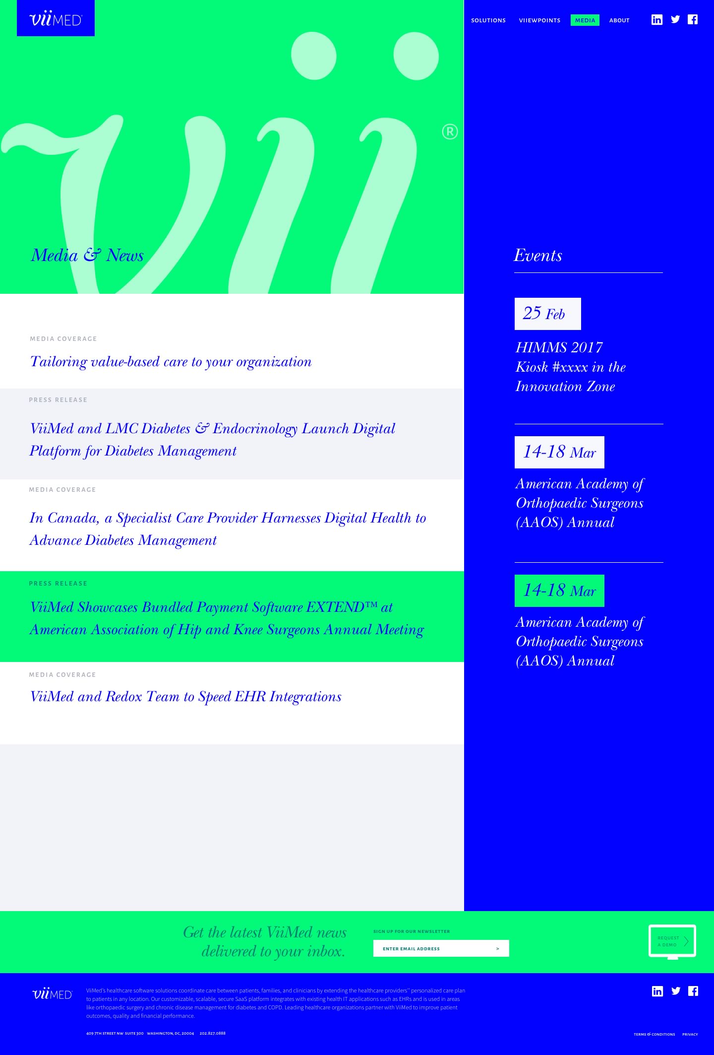
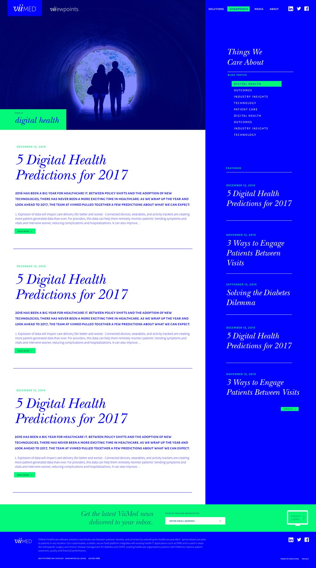
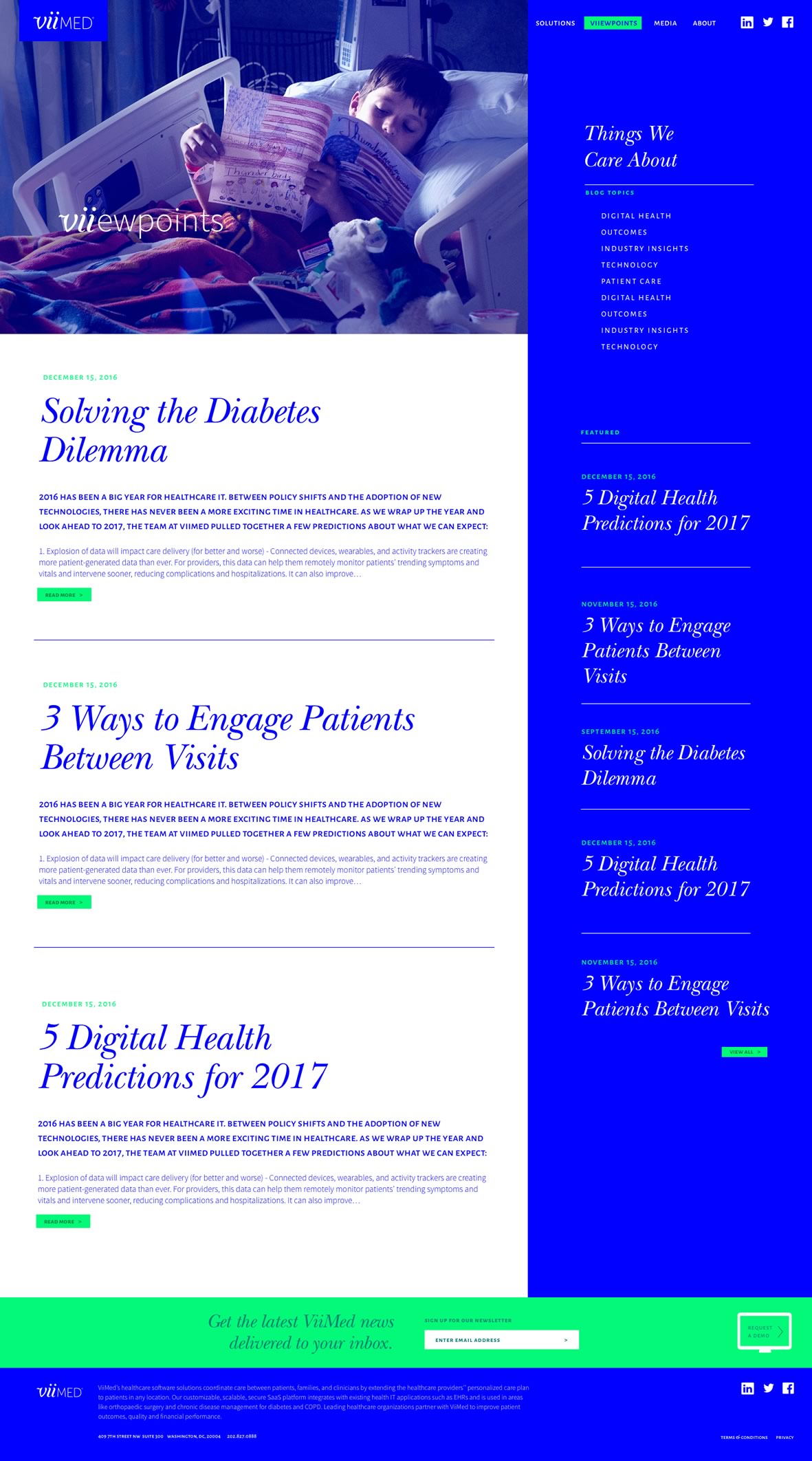
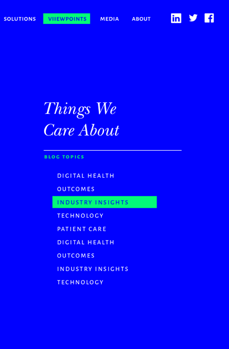
Implementation
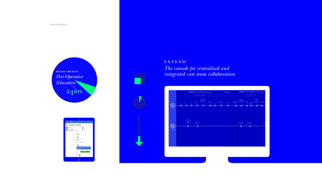
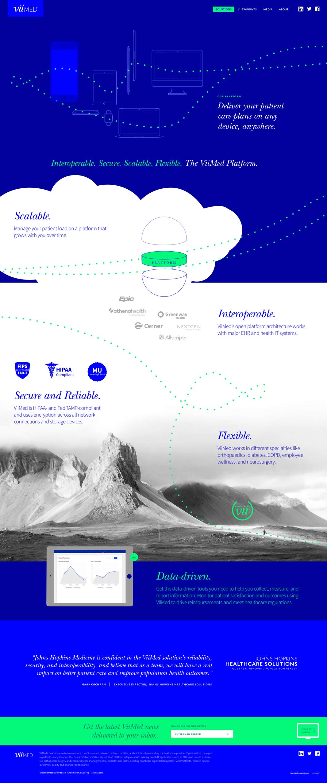
Website Design
The rollout.
Introducing the Rebrand
Digital marketing is usually the first touchpoint a consumer has with a company’s rebrand. Through the website redesign, ViiMed was able to convey the direction it was headed, and allowed consumers another opportunity to align with its values.
We identified key areas of concern and through the rebrand—and design of digital marketing materials, we were able to create:
♥ An improved level of trust in ViiMed’s product and people,
♥ Brevity in ViiMed’s messaging — speaking specifically to their clients’ pains,
♥ Assurance in ViiMed’s investment to long-term evolution and innovation of their product,
♥ and recognition and distinction in a saturated market.
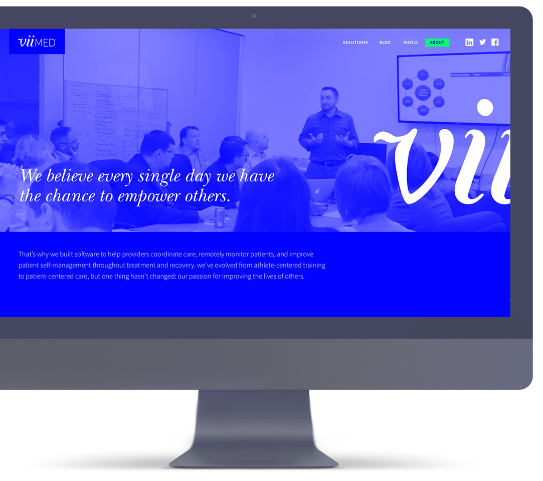
Building from the framework of their new brand assets and messaging tone, we were able to create an engaging user experience, and give their marketing team the foundation to build upon.


Implementation
Initial Print Collateral